Our Services
Application Development
Blockchain and Web 3.0 Consulting
Smart Contract Development
Digital Transformation
Business Process Automation
Image and Natural Language Processing Solutions
Custom/Predictive Modeling and Analysis
IoT Security Solutions
IoT System Architecture Design
Microservices and Containerization
CI/CD Implementation
User Experience Research and Testing
User Interface Design
ERP System Implementation
Custom CRM Solutions
Managed Cloud Services
Cloud Migration and Consulting
Mobile Application Development
Web Application Development
A comprehensive guide to multi-platform design

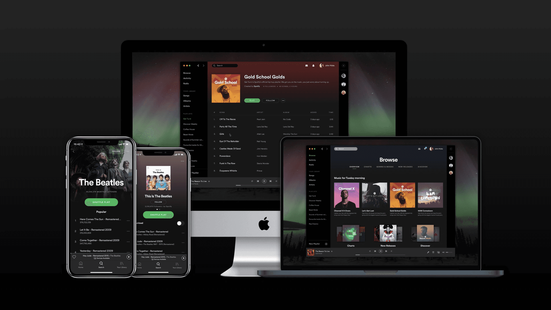
In the ever-evolving and dynamic realm of digital experiences, users expect fluidity—a seamless experience as they move from a smartphone during their morning commute to a desktop at work and perhaps a smart TV in the evening.
With an ever-growing diverse list of devices, the demand for design practices that effortlessly adapt to this diverse ecosystem is not just a preference—it's a necessity.
Going beyond responsiveness
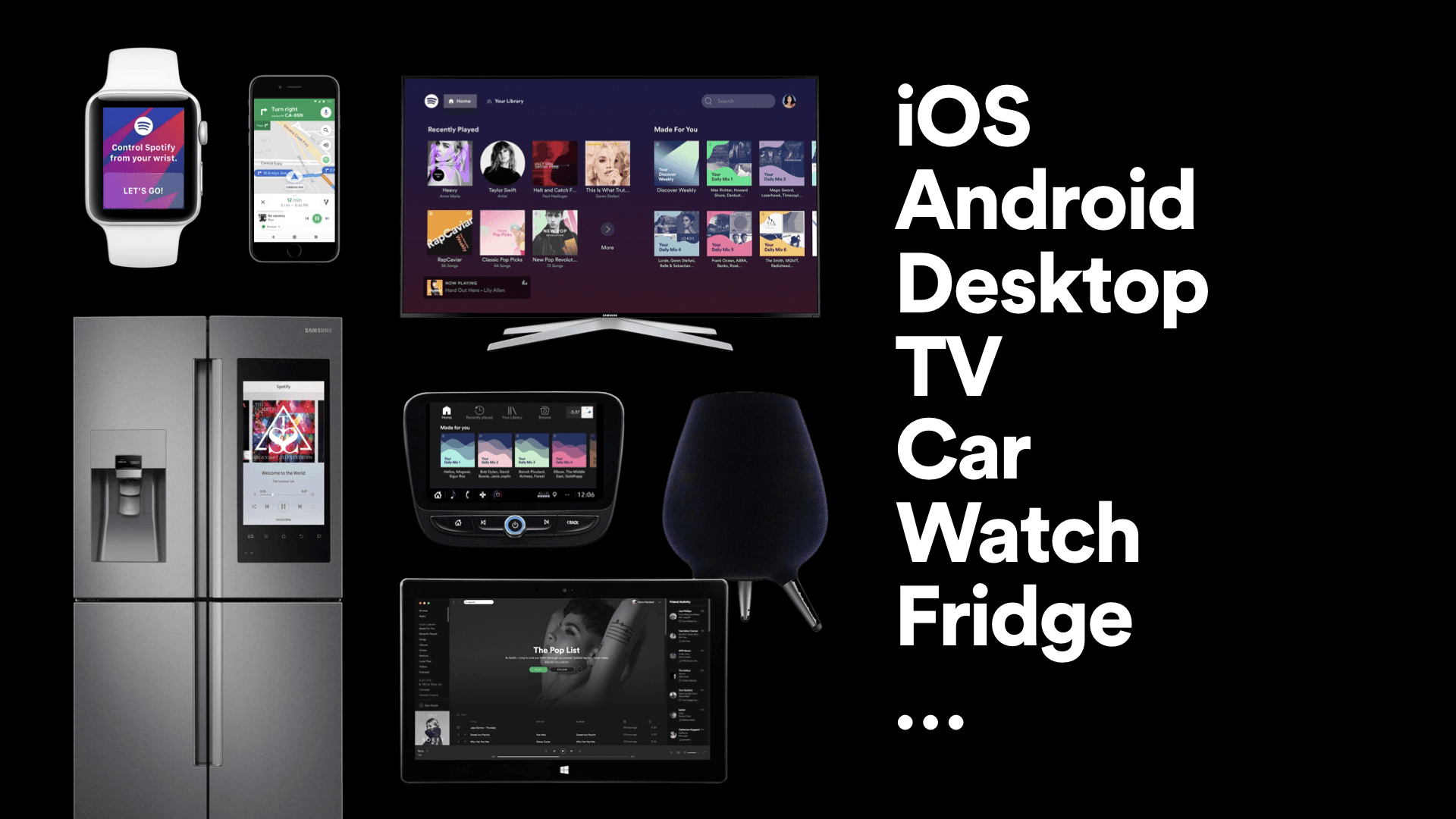
Being multi-platform isn't just about screen sizes – it's way bigger. Picture this: web, mobile, smartwatch, TV, even automotive systems—the list just goes on. Your product needs to be everywhere, from IOS to Android. And just when you think you're done, the future throws in spatial design, VR, AR experiences, mixed realities, and who knows what else!
But, why bother with all these platforms?
Meeting user expectations and ensuring a seamless transition
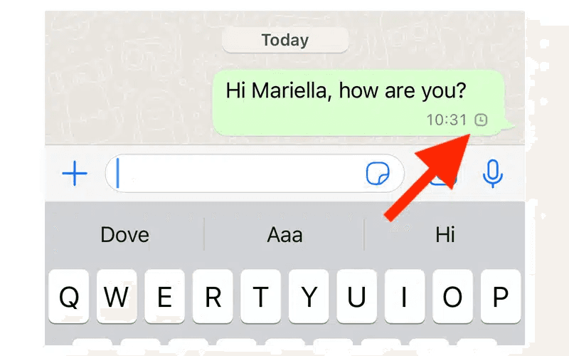
Imagine browsing products on your tablet and switching to your laptop to complete the purchase. If the transition between devices is not seamless, and you have to relearn navigation or encounter discrepancies in the shopping cart, frustration may arise.
Users anticipate a consistent and fluid experience as they switch devices.
Reaching wider audiences for business success
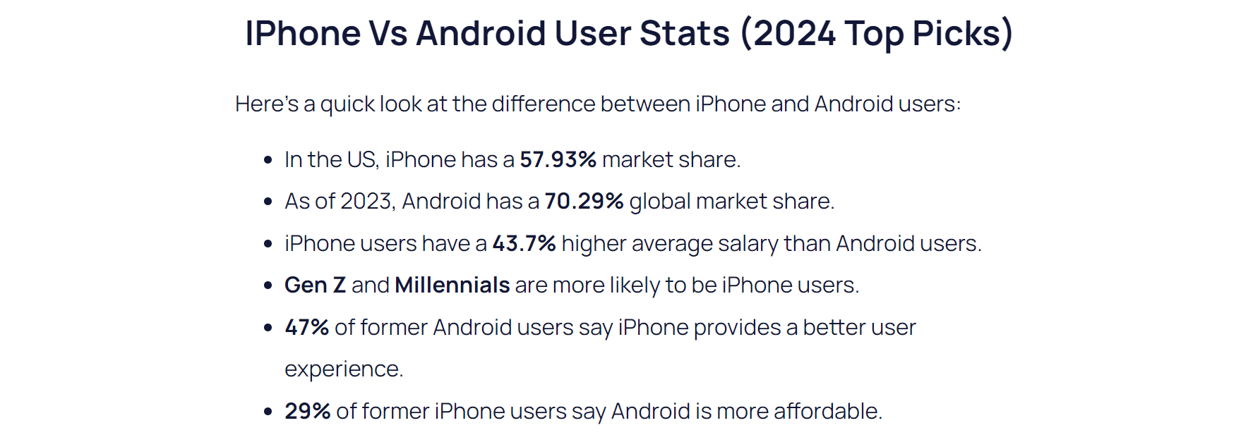
https://explodingtopics.com/blog/iphone-android-users
As the stats show above, disregarding any particular platform entails overlooking a substantial market base. Such a preference diminishes the opportunities for business expansion.
Designing for multiple platforms, on the other hand, broadens your product's reach, accessing diverse markets and demographics. This strategic approach not only positions the product for success but also enhances user engagement by catering to varied preferences across different platforms.
Forging brand consistency across platforms
Consistency stands as a cornerstone in fortifying a robust brand identity and plays a pivotal role in enhancing brand recognition and fostering trust among users.
It is imperative that your product maintains a uniform look and feel irrespective of the platform it operates on. This commitment to uniformity not only contributes to a cohesive and recognizable brand image but also instills a sense of reliability and familiarity among users.
Optimizing development and maintenance
Efficient multi-platform design isn't just user-friendly; it streamlines development and maintenance processes. By adopting a modular and scalable approach, designers and developers can save time and resources. Updates and new features can be implemented more smoothly across platforms, reducing the overall workload and ensuring a quicker response to evolving user needs.
In essence, the significance of multi-platform design extends beyond aesthetics; it's a strategic necessity for any digital venture aiming to thrive in a landscape marked by diversity and continual technological evolution.
Now that we know it’s important, let's delve into the hows of achieving multi-platform design in our product.
Designing for multiple platforms
Identifying which platforms to consider
Every product comes with unique requirements, and adopting a one-size-fits-all approach is not the solution.
For instance, if you have an internal tool exclusively used by your employees on a desktop, there's no necessity to extend your design considerations to mobile or other platforms. But if you are working on a streaming app, you must account for adaptations on the web, mobile, and TV.
To truly master this, immerse yourself in understanding your users' needs. Start by finding answers to questions such as:
Who will be using my product, and what drives their usage?
Where will they be using my product?
On which current platforms is my product being used?
What are the usage patterns, and how frequently do users switch between them?
Is there a need to expand our product to other platforms?
What user and business value do we derive from each platform?
Is there a platform that requires more focus compared to others, and why?
These questions serve as a starting point. A profound comprehension of your users, your product, and the intricate relationship between the two will provide a robust foundation. It will guide you in determining which platforms are worth considering, and how to leverage them for an enhanced user experience.
Take Swiggy, India's leading food ordering and delivery giant, as an example. Initially, their product spanned web and mobile apps until a strategic decision unfolded to extend their offerings to smartwatches. This wasn't a random whim but a meticulously calculated move.

The Swiggy data team delved into user behavior and uncovered a significant use case: most users track their order status once it's placed, and doing so on a mobile app or web platform often interfered with their real-world activities. Recognizing this user pain point, they conceived the idea of expanding the order-tracking experience to the realm of smartwatches. This innovation allowed users to monitor their orders seamlessly without disrupting their real-world experiences. Although they acknowledged that this move would target a premium user base, their decision was made with careful consideration.
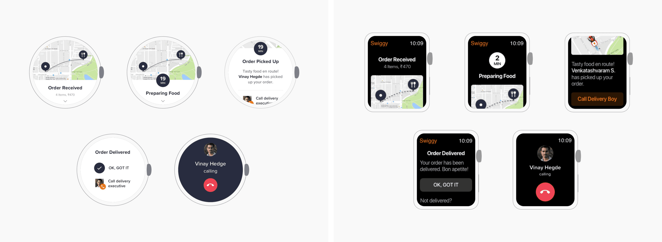
https://milanmaheshwari.design/swiggywatch.html
Swiggy's approach involved a thorough assessment of the need for platform expansion. They pondered why they wanted to do it, what value it would bring, and whether it was feasible. Moreover, they meticulously determined the features that needed representation on the smartwatch compared to the app, ensuring a thoughtful and strategic approach to their product evolution. Read more about it here.
The key to success lies in aligning your design strategy with your essential needs. By catering to the specific requirements of your product and your users, you ensure a targeted and effective multi-platform design approach.
Understanding cross-platform differences
Choosing the platforms for your product is one challenge while crafting the product experiences within those is another.
Design conventions are not uniform across platforms; they vary significantly based on the device's characteristics and functionalities. Desktops, for instance, provide ample screen space compared to the more compact screens of tablets or mobile phones. Additionally, the methods of interaction differ, with desktops utilizing a mouse and tablets/mobiles relying on touch input. TVs are optimized for viewing at a distance, while smartwatches prioritize presenting essential information concisely and promptly.
When you design for these different platforms, you need to start by understanding the fundamental device characteristics and patterns that distinguish these experiences. Using these characteristics and patterns to inform your design decisions can help you provide a product that your users appreciate.
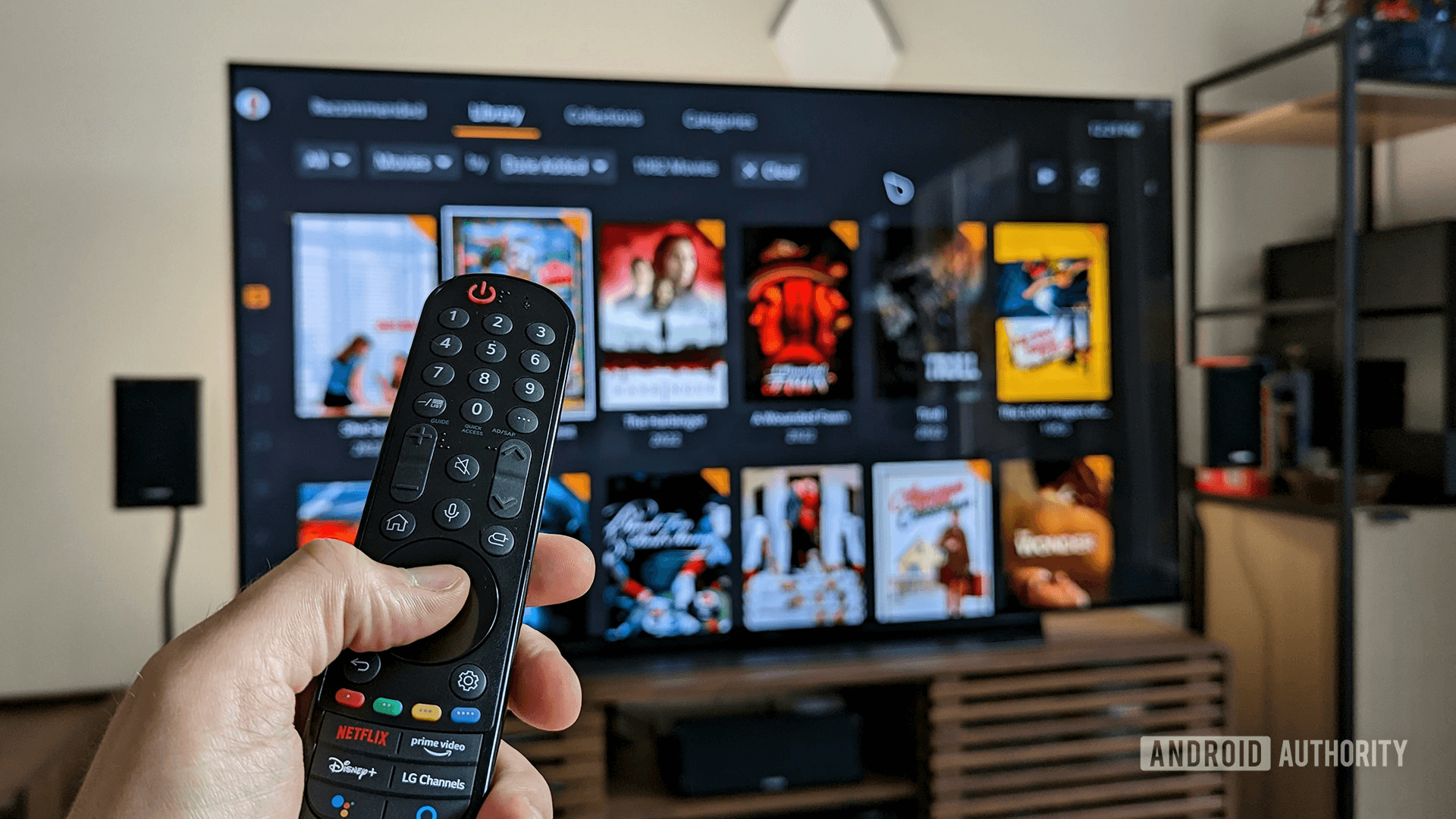
Consider a TV for example, a TV typically has a very large, high-resolution display. Although people generally remain a few feet away from their stationary TV, they sometimes continue to interact with content as they move around the room. People can use a remote, a game controller, their voice, or even apps running on their other devices to interact with their TV and often get deeply immersed in a single experience — often lasting hours. Given these characteristics and usage patterns, it's crucial to tailor your product experiences for TV accordingly. This includes ensuring a significant font size to facilitate easy viewing and reading from a distance, as well as designing navigation with remote controls in mind. These considerations contribute to a product experience that truly stands out.
While the considerations for TV focus on its large display and remote interactions, smartwatches exhibit markedly different characteristics. With their relatively small screens worn around the wrist, they are no more than a foot away from the user's eyes. Interaction occurs through touch gestures, the digital crown in watchOS, and voice inputs. Due to limited screen space, smartwatch experiences should prioritize quick, glanceable, and single-screen interactions that deliver essential information concisely, enabling users to perform targeted actions with minimal effort. The challenge is to deliver critical information concisely in a single glance, considering the watch's usage in various environments, from bright sunlight to darkness. It's a space where every pixel matters.
It is crucial to exercise caution in deciding what information to present on your app for smartwatches. Focus on including only important and highly valuable information, along with accurate and relevant notifications. Take a cue from Swiggy, as mentioned above, where they streamlined the order tracking experience on the smartwatch interface by highlighting the essential and crucial aspects rather than duplicating the entire mobile experience.
Now let’s consider another domain. Imagine you're behind the wheel, navigating through the bustling city streets. As you drive, you reach over to the sleek infotainment system to adjust the volume, wanting to immerse yourself in your favorite tunes.
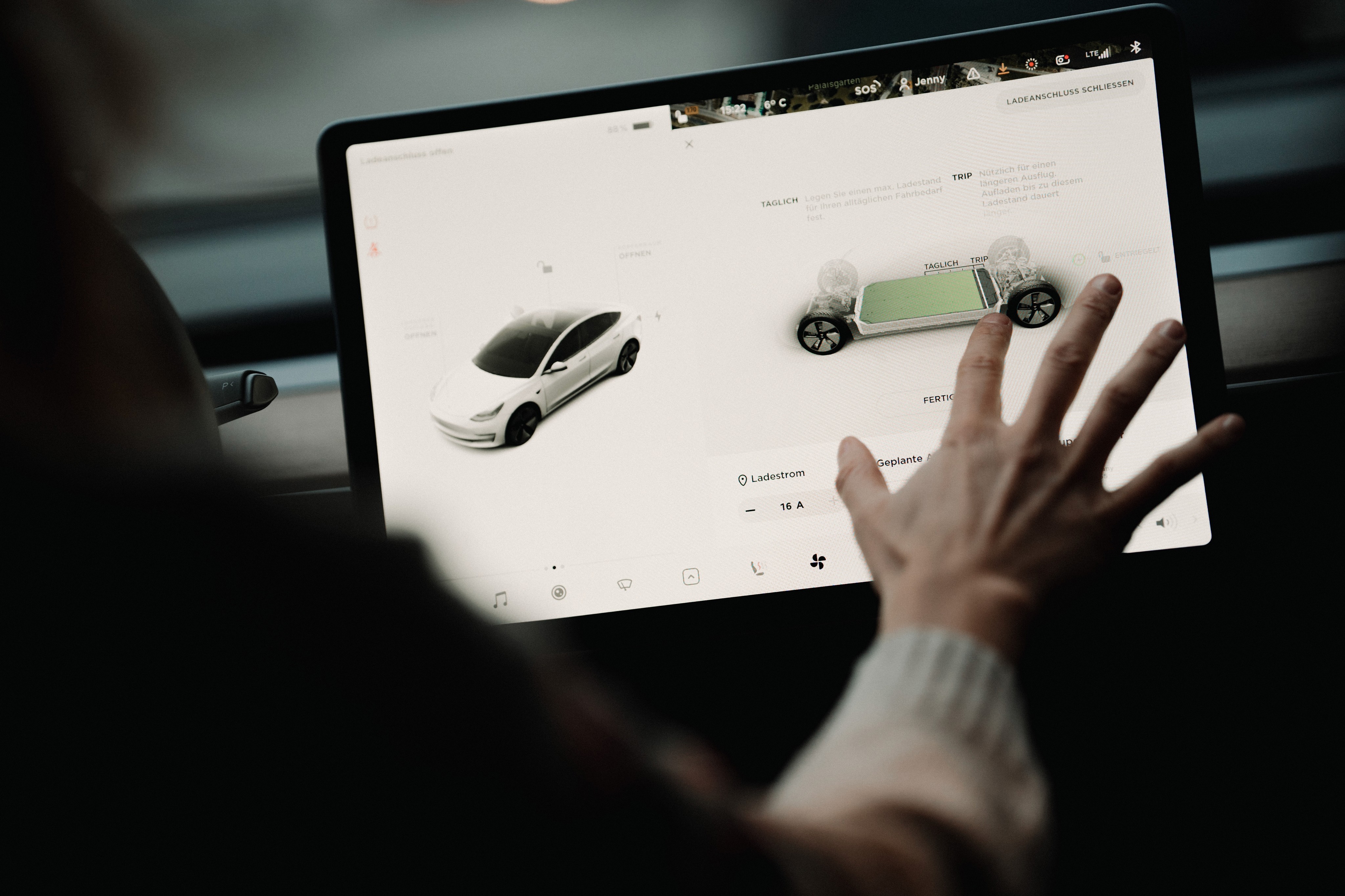
As your finger glides over the virtual volume control on the touchscreen, you not only see the on-screen animation responding to your touch, but you also feel a subtle vibration acknowledging each adjustment.
The tactile confirmation assures you that the volume is changing, all without diverting your attention from the road. No need to glance at the screen; you just know it's working.
The marriage of haptics and animations transforms a routine task into a sensory experience. This small enhancement takes the driving experience to another level, making it safer by allowing you to keep your focus where it matters most—on the road ahead.
Understanding the relevance of information for each platform is key. Consider how the information will be used in a specific context, and then make informed decisions about its inclusion.
It's essential to acknowledge that diversity in design goes beyond just screen size to encompass functionality and input methods across platforms. As a designer, the responsibility lies in comprehending and adapting to the distinct behavior and patterns of each platform.
Furthermore, challenges arise in adhering to the guidelines set by different operating systems. Take, for instance, the contrasting guidelines provided by iOS and Android. Navigating these nuances requires a keen understanding of the distinct design principles that govern each operating system, adding an extra layer of complexity to the multi-platform design process.
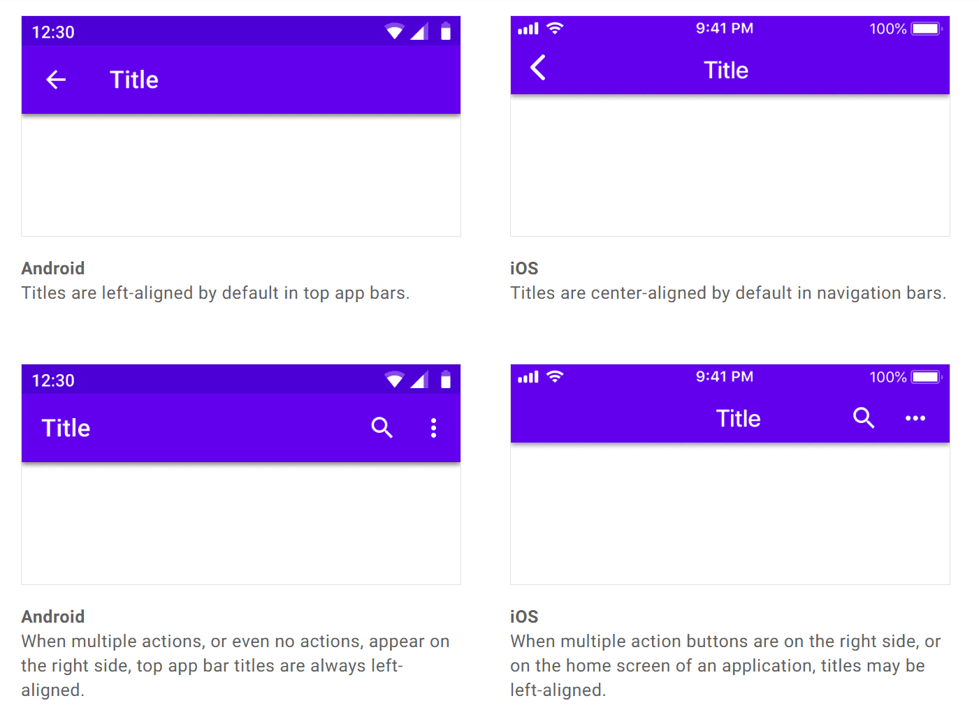
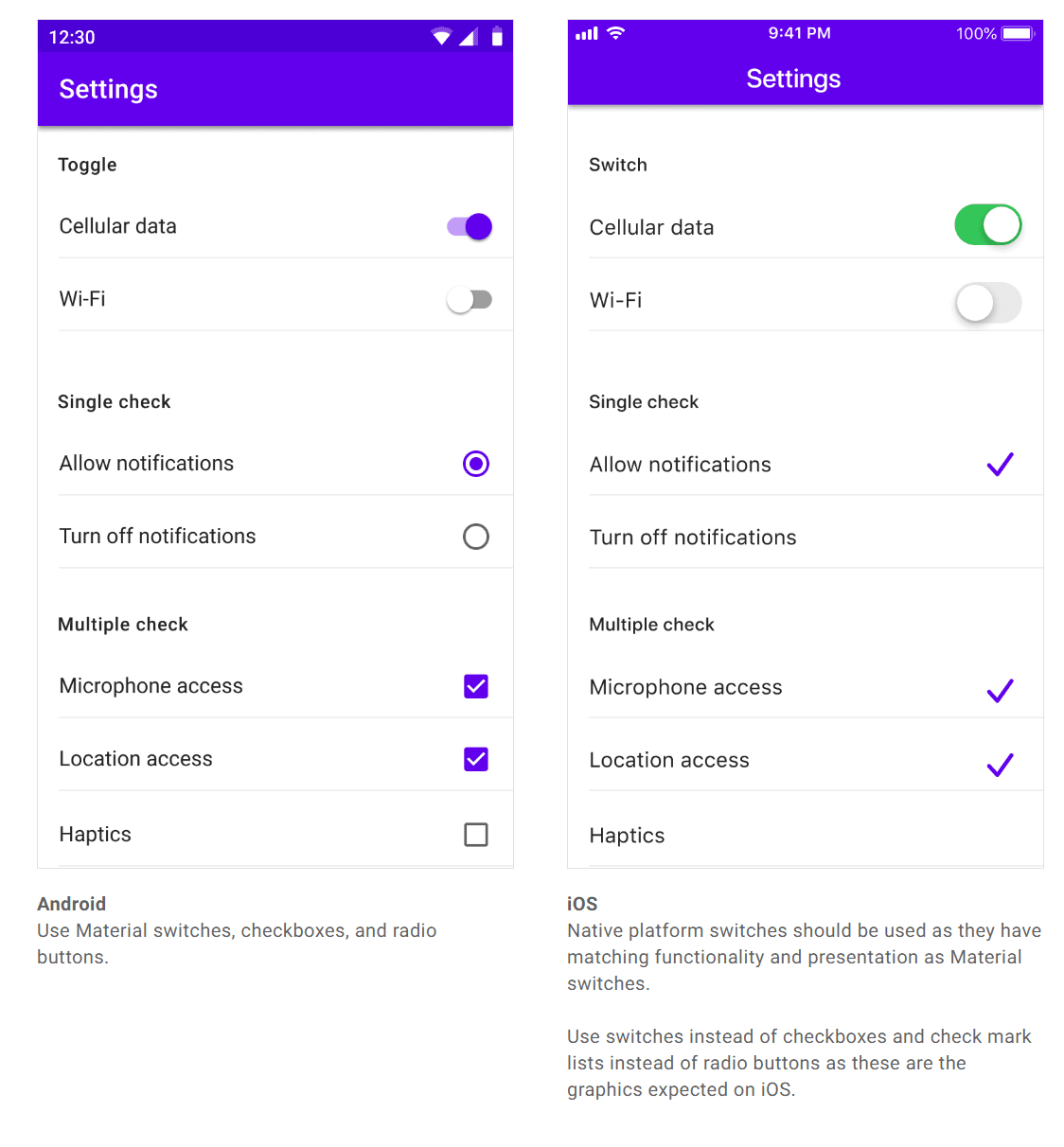
Users accustomed to a particular operating system become familiar with its platform-specific guidelines. When your product exists on that platform, users naturally expect it to adhere to and behave consistently with the established norms of that operating system. This familiarity contributes to a more intuitive and user-friendly experience, as users can leverage their existing knowledge of the platform's conventions when interacting with your product.
How to design for all these different platforms?
Coherency over consistency
While aligning with platform-specific behaviors is crucial, it's equally important for your product to maintain its unique identity across platforms. Instead of striving for strict consistency, the goal is coherency.
Coherency, in this context, involves striking a balance where you establish and uphold your brand identity while also respecting the existing behaviors and patterns ingrained in users on specific platforms. By being coherent, you create a harmonious user experience that feels native to each platform without sacrificing the distinctiveness of your product's identity.
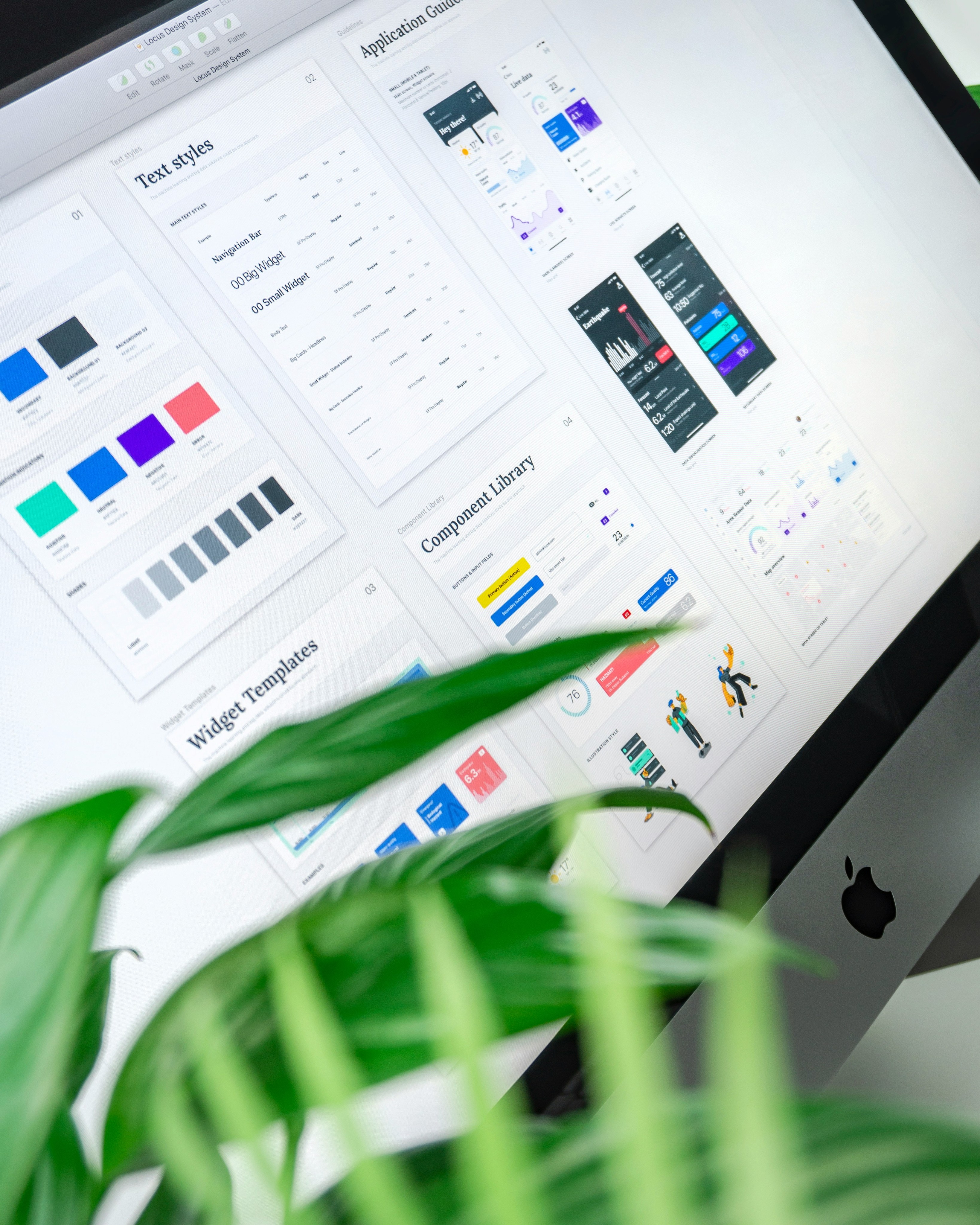
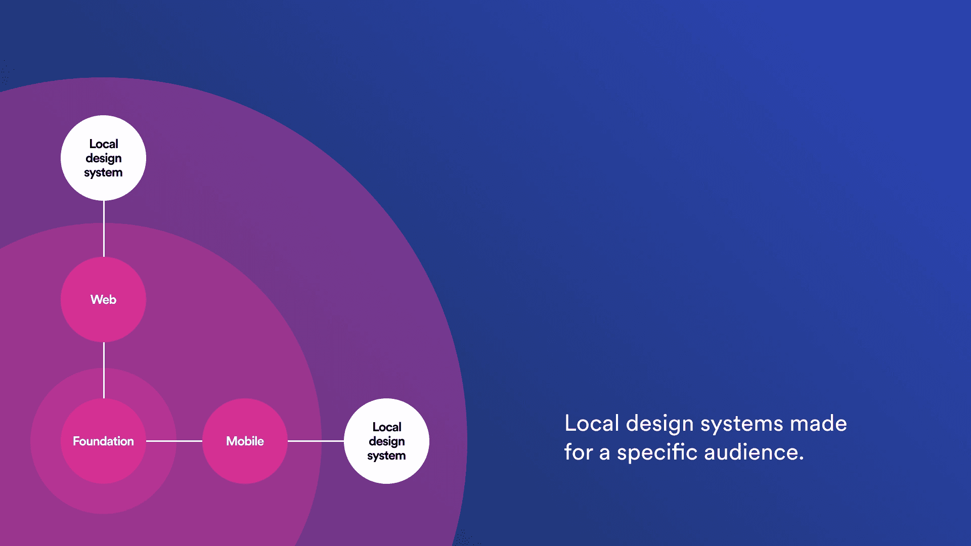
Designing and developing for such diverse use cases can be an intimidating task. Achieving alignment and ensuring everyone is on the same page presents its challenges. To tackle this complexity head-on, having a well-documented structure is crucial to ensure seamless collaboration and a unified direction for all teams. This is where a meticulously crafted design system comes to the rescue.
While the creation and maintenance of a design system may seem resource-intensive in terms of time and money, the investment pays off in the long run. Fortunately, we don't always have to start from scratch. Access to exceptional open-source design systems allows us to leverage existing frameworks and tailor them to our specific needs.
Ensuring a unique identity across platforms- Creating a multi-platform design system
The strength of any structure lies in the integrity of its foundation. This principle holds for your design system as well – it becomes robust only if the foundation is crafted meticulously. This foundational layer is crucial for maintaining your brand identity consistently across diverse devices and platforms.
Take Netflix as a prime example. When you shift from using it on your mobile device to your desktop or TV, you encounter distinct behaviors and functionalities. Yet, amidst these differences, a clear visual coherence persists, unmistakably labeling the product as Netflix.
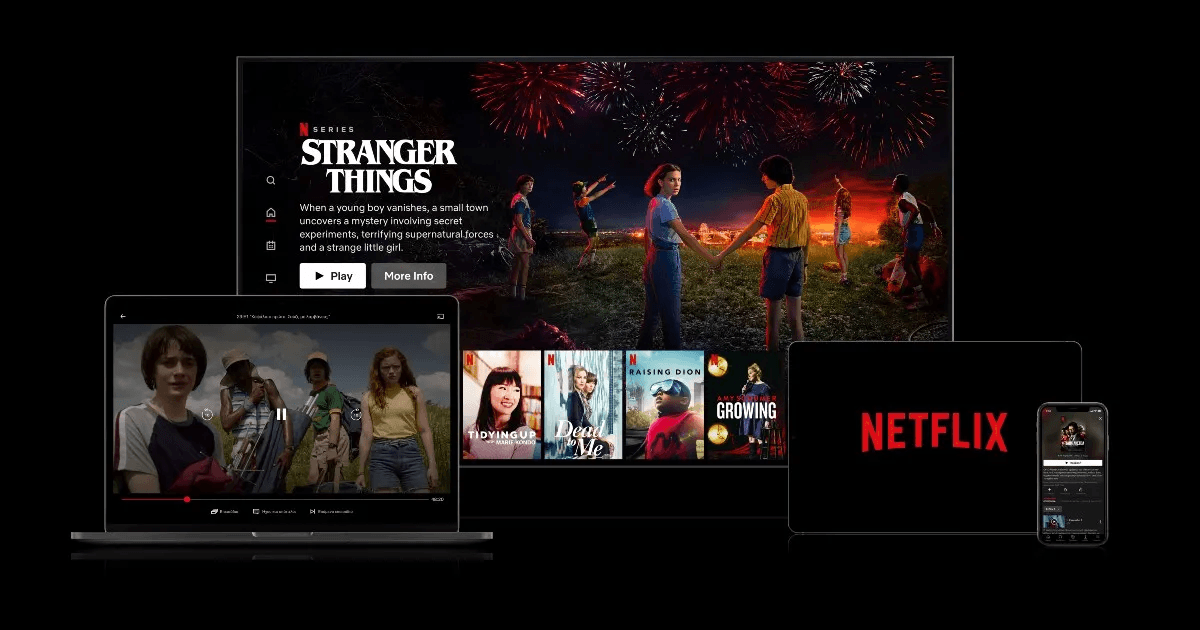
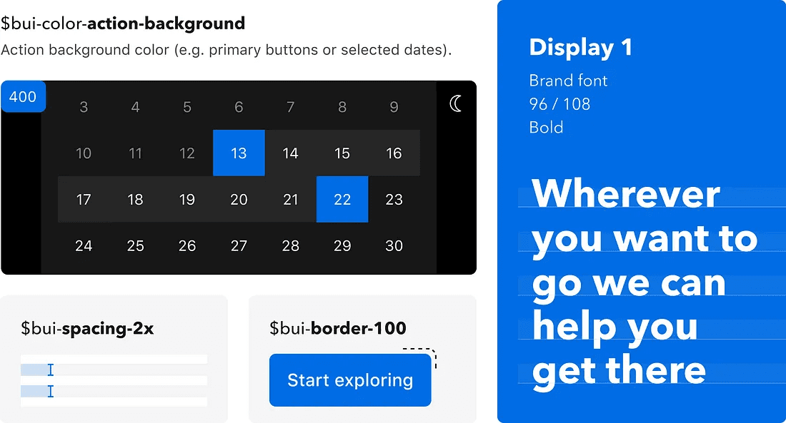
The key to this consistency is the solid foundation laid by Netflix for its product. This foundation consists of a robust design language encompassing colors, typography, spacing, layout, and motion.
Tokenizing the fundamentals
These fundamental elements are embedded as a strong foundational layer, both in design and code, facilitated by the use of design tokens.
Design tokens play a pivotal role in establishing a cohesive and adaptable foundation for cross-platform design. By using a consistent set of tokens, designers and developers can easily communicate and collaborate across different platforms. This consistency not only enhances efficiency but also reduces the likelihood of discrepancies in the user interface.
Furthermore, they facilitate scalability. As applications and products evolve, the use of tokens allows for quick and systematic updates. If a design element needs to be modified – say, a primary color or font size – changing the corresponding token can instantly propagate the update throughout the entire design system. This agility is crucial for maintaining a coherent brand identity and user experience across diverse platforms.
Booking.com strategically employed design tokens to foster a sense of unity among their products, despite their existence on different platforms.
https://booking.design/how-we-built-our-multi-platform-design-system-at-booking-com-d7b895399d40
When delving into the creation of design tokens, a crucial consideration is the active and early collaboration with your dev team. The names assigned to your tokens within the Figma library will directly translate into the code base. Therefore, establishing common ground with developers early in the process is imperative.
It's essential to emphasize that every element conceived by a designer must find its counterpart in the code base. The synergy between the design and development teams is paramount for the effective functioning of a design system. This alignment should be established right from the project's inception.
This brings us to the next critical phase of crafting our multi-platform design system.
Components and definitions
Integrating reusable components within your design system is a pivotal strategy for long-term efficiency. The early definition of these components minimizes the need to extensively deliberate on the visual aspects of new features. This, in turn, allows designers to focus their attention on more critical elements such as user flows and functionality. Simultaneously, the existence of pre-coded components in the design system accelerates the development process, enabling developers to expedite the shipping of new features and ultimately reduce technical debts.
The creation of components also presents an opportune moment to address cross-platform disparities and incorporate variants where applicable.
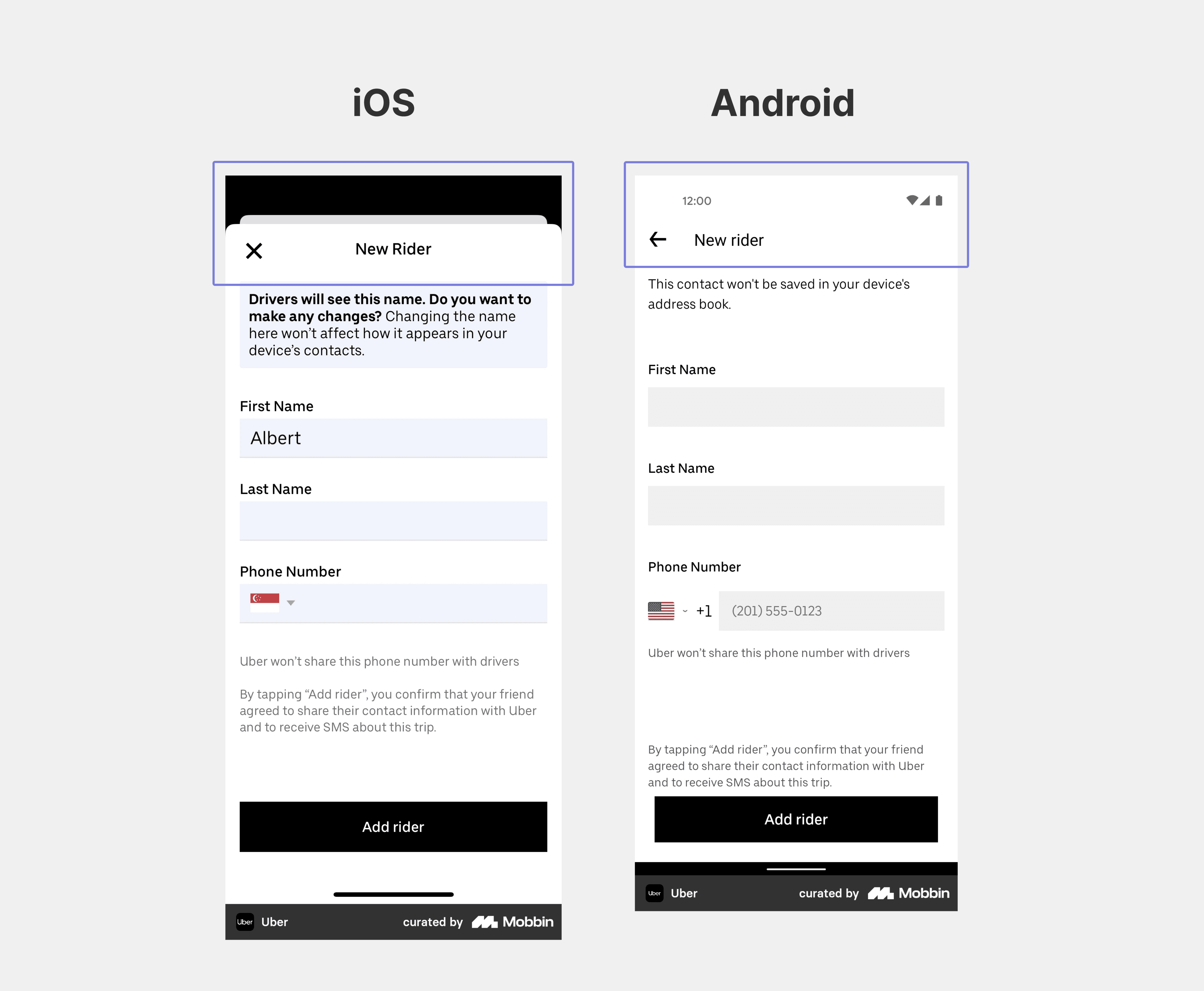
For instance, let's consider a simple example – modal sheets. The behavior of opening a new modal sheet on top of an existing one is visually distinct for iOS and Android. Recognizing these platform-specific nuances during the component creation phase ensures a more coherent user experience across diverse platforms.
An effective approach to address such variations is to consider these differences at the smallest level of detail.
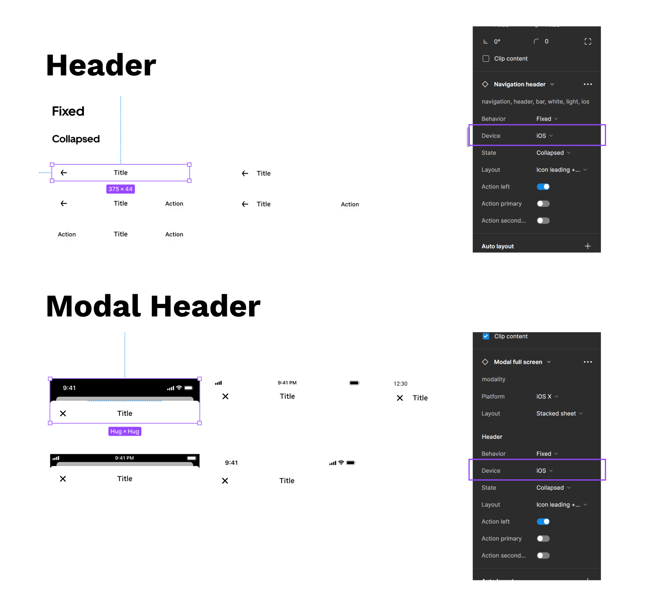
The design system implemented by Uber.com handles these discrepancies really well. They've strategically crafted separate variants for iOS and Android, beginning at the header level and then extending to the modal header level. This meticulous approach ensures that when designing a screen or feature for multiple platforms, making adjustments is just a few property changes away. By establishing variants at these granular levels, designers can efficiently adapt the interface to meet the nuanced requirements of different platforms, fostering a more streamlined and cohesive multi-platform design.
https://base.uber.com/6d2425e9f/p/294ab4-base-design-system
The importance of naming and defining components and their properties becomes evident at this crucial stage of design.
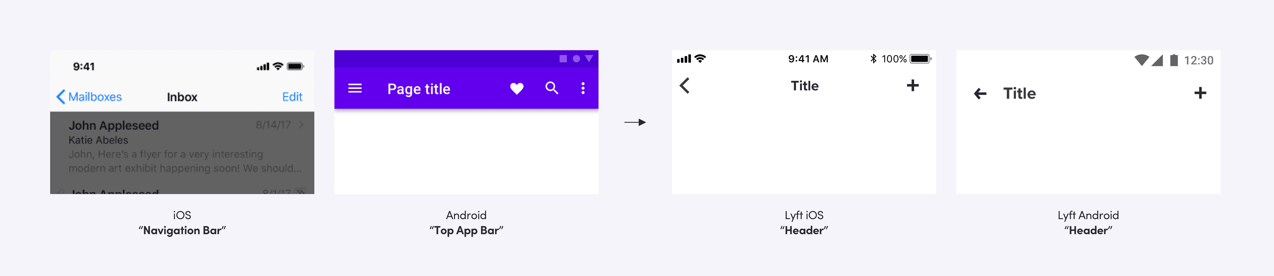
An illustrative example of the Lyft design team's practices can be found in the article here. The team emphasizes meticulous care in naming components to ensure parity across platforms. They made a deliberate decision to rename their navigation bar component to "header" to establish a common language between the engineering and design teams. This choice underscores the significance of clear and aligned terminology, fostering seamless collaboration between different teams involved in the multi-platform design process.
Having the development team present at every major design iteration is a crucial practice. By involving them early and consistently, you facilitate a collaborative environment where every component can be thoroughly reviewed. This proactive engagement is essential to address any challenges that may arise due to property declarations in the code base. Ensuring that developers are part of the design review process allows for a comprehensive understanding of how design decisions translate into technical implementation.
Ensuring feature parity
Ultimately, the degree of parity you aim for in your features is a decision that requires careful consideration. While acknowledging the benefits of platform parity, there may be instances where you opt for a more consistent experience by defining your own set of guidelines. As a designer, your responsibility is to determine what aligns best with the needs of your users and the objectives of your product.
This decision-making process may not be straightforward, but leveraging various research methodologies and testing techniques can expedite reaching a well-informed conclusion.
With your components properly defined, you can now proceed to articulate the patterns and finalize your multi-platform design system.
Maintaining continuity across platforms
Establishing sufficient parity across platforms introduces another crucial concept: continuity. While it's undeniable that users are accustomed to each platform's unique characteristics and patterns, ensuring that your product seamlessly adapts to these nuances is only a part of the equation. Equally important is avoiding any disruption in the user experience when transitioning between platforms. The shift across platforms should be fluid and continuous.
Cross-Platform Data Syncing
Maintaining this continuity across devices is facilitated through data synchronization. If you've read and starred an email on your mobile device, it should reflect the same state when accessed on a desktop. Password managers and cloud storage services are effective tools for achieving seamless data synchronization.
This synchronization also extends its benefits to enhance offline capabilities, allowing users to work offline and automatically sync their data once they regain internet access. For mobile devices, especially those operating on mobile data away from home Wi-Fi, optimizing for low bandwidth becomes crucial. It's essential to ensure that our products function seamlessly at all times and accommodate any network changes that might occur.
Adapting to low bandwidth can involve practices such as promptly informing users of network problems, assuring them that any progress made will be saved, and allowing them to continue once internet capabilities are restored. Instagram excels in this aspect by enabling users to add pictures to their stories even when offline and automatically publishing them as soon as the network is available. WhatsApp also considers lower bandwidths, displaying a "pending" status in chats to indicate that a message has not yet been sent and automatically sending those messages as soon as the network is regained.
When creating products, it's crucial to test them in all possible edge-case scenarios that users might encounter. Only through such comprehensive testing can truly accessible and inclusive designs be achieved.
Emphasizing Clear Documentation
Once your design system is established, its successful adoption by other teams hinges on clear and comprehensive documentation. Documenting every decision and guideline, from both the design and development perspectives, is crucial to facilitate smooth integration and adaptation in the future.
It's essential to recognize that designing systems is an ongoing process, not a one-time endeavor. The evolving needs and features of your product necessitate a continuous refinement and evolution of your design system to ensure its relevance and effectiveness over time. Regular updates and well-documented changes contribute to a more resilient and adaptable multi-platform design system.
How Spotify navigates the intricate landscape of 45 different platforms?
While a design system is valuable for achieving a consistent cross-platform experience, it may not always suffice. Take Spotify for instance. Spotify has scaled to support 45 different platforms. That’s INSANE!!!
Managing multi-platform consistency with a single design system proved difficult for Spotify, given their preference to avoid excessive centralization and grant autonomy to individual teams. Consequently, multiple design systems emerged, each managed independently by different teams. This approach fostered autonomy but posed challenges in maintaining coherence across platforms.
To address these issues, Spotify introduced a new framework called "Encore - System of Systems." Encore's foundation is built on Spotify's core design principles in the form of design tokens followed by Encore Web and Encore Mobile, housing resources specific to web and mobile platforms, respectively.
Both the web and mobile systems share the same foundational design, ensuring a consistent look and feel for Spotify across various platforms. This innovative framework allows the Spotify team to collaborate cohesively while maintaining autonomy over their respective products. Read more about it here.
To sum up…
Ensuring a seamless user experience across various platforms is a crucial consideration that demands careful attention. The process begins with thorough research to identify the target platforms, followed by designing the product to effectively adapt to different devices. Design systems play a pivotal role not only in facilitating multi-platform adaptation but also in bridging the gap between design and development, fostering collaboration throughout the development stages.
Maintaining a robust foundation is vital for building exceptional products collaboratively. This involves continuous communication and refinement of the design system based on the evolving dynamics of the product. By doing so, teams are empowered to work seamlessly together, ultimately contributing to the success of multi-platform design initiatives.
Recognizing that every product is unique, each with its own set of requirements and strategies for development, it is imperative to tailor approaches to align with specific needs and user preferences.
This article highlights some best practices employed by renowned brands to achieve their goals, serving as inspiration for your journey.
If you need a hand figuring out your path, hit us up. We're here and happy to help!
References
[1] https://dbanks.design/blog/multi-platform/
[2] https://developer.apple.com/design/human-interface-guidelines
[3] https://medium.com/eightshapes-llc/finding-platform-balance-in-a-design-system-47eaae48de98
In the ever-evolving and dynamic realm of digital experiences, users expect fluidity—a seamless experience as they move from a smartphone during their morning commute to a desktop at work and perhaps a smart TV in the evening.
With an ever-growing diverse list of devices, the demand for design practices that effortlessly adapt to this diverse ecosystem is not just a preference—it's a necessity.
Going beyond responsiveness
Being multi-platform isn't just about screen sizes – it's way bigger. Picture this: web, mobile, smartwatch, TV, even automotive systems—the list just goes on. Your product needs to be everywhere, from IOS to Android. And just when you think you're done, the future throws in spatial design, VR, AR experiences, mixed realities, and who knows what else!
But, why bother with all these platforms?
Meeting user expectations and ensuring a seamless transition
Imagine browsing products on your tablet and switching to your laptop to complete the purchase. If the transition between devices is not seamless, and you have to relearn navigation or encounter discrepancies in the shopping cart, frustration may arise.
Users anticipate a consistent and fluid experience as they switch devices.
Reaching wider audiences for business success
https://explodingtopics.com/blog/iphone-android-users
As the stats show above, disregarding any particular platform entails overlooking a substantial market base. Such a preference diminishes the opportunities for business expansion.
Designing for multiple platforms, on the other hand, broadens your product's reach, accessing diverse markets and demographics. This strategic approach not only positions the product for success but also enhances user engagement by catering to varied preferences across different platforms.
Forging brand consistency across platforms
Consistency stands as a cornerstone in fortifying a robust brand identity and plays a pivotal role in enhancing brand recognition and fostering trust among users.
It is imperative that your product maintains a uniform look and feel irrespective of the platform it operates on. This commitment to uniformity not only contributes to a cohesive and recognizable brand image but also instills a sense of reliability and familiarity among users.
Optimizing development and maintenance
Efficient multi-platform design isn't just user-friendly; it streamlines development and maintenance processes. By adopting a modular and scalable approach, designers and developers can save time and resources. Updates and new features can be implemented more smoothly across platforms, reducing the overall workload and ensuring a quicker response to evolving user needs.
In essence, the significance of multi-platform design extends beyond aesthetics; it's a strategic necessity for any digital venture aiming to thrive in a landscape marked by diversity and continual technological evolution.
Now that we know it’s important, let's delve into the hows of achieving multi-platform design in our product.
Designing for multiple platforms
Identifying which platforms to consider
Every product comes with unique requirements, and adopting a one-size-fits-all approach is not the solution.
For instance, if you have an internal tool exclusively used by your employees on a desktop, there's no necessity to extend your design considerations to mobile or other platforms. But if you are working on a streaming app, you must account for adaptations on the web, mobile, and TV.
To truly master this, immerse yourself in understanding your users' needs. Start by finding answers to questions such as:
Who will be using my product, and what drives their usage?
Where will they be using my product?
On which current platforms is my product being used?
What are the usage patterns, and how frequently do users switch between them?
Is there a need to expand our product to other platforms?
What user and business value do we derive from each platform?
Is there a platform that requires more focus compared to others, and why?
These questions serve as a starting point. A profound comprehension of your users, your product, and the intricate relationship between the two will provide a robust foundation. It will guide you in determining which platforms are worth considering, and how to leverage them for an enhanced user experience.
Take Swiggy, India's leading food ordering and delivery giant, as an example. Initially, their product spanned web and mobile apps until a strategic decision unfolded to extend their offerings to smartwatches. This wasn't a random whim but a meticulously calculated move.
The Swiggy data team delved into user behavior and uncovered a significant use case: most users track their order status once it's placed, and doing so on a mobile app or web platform often interfered with their real-world activities. Recognizing this user pain point, they conceived the idea of expanding the order-tracking experience to the realm of smartwatches. This innovation allowed users to monitor their orders seamlessly without disrupting their real-world experiences. Although they acknowledged that this move would target a premium user base, their decision was made with careful consideration.
https://milanmaheshwari.design/swiggywatch.html
Swiggy's approach involved a thorough assessment of the need for platform expansion. They pondered why they wanted to do it, what value it would bring, and whether it was feasible. Moreover, they meticulously determined the features that needed representation on the smartwatch compared to the app, ensuring a thoughtful and strategic approach to their product evolution. Read more about it here.
The key to success lies in aligning your design strategy with your essential needs. By catering to the specific requirements of your product and your users, you ensure a targeted and effective multi-platform design approach.
Understanding cross-platform differences
Choosing the platforms for your product is one challenge while crafting the product experiences within those is another.
Design conventions are not uniform across platforms; they vary significantly based on the device's characteristics and functionalities. Desktops, for instance, provide ample screen space compared to the more compact screens of tablets or mobile phones. Additionally, the methods of interaction differ, with desktops utilizing a mouse and tablets/mobiles relying on touch input. TVs are optimized for viewing at a distance, while smartwatches prioritize presenting essential information concisely and promptly.
When you design for these different platforms, you need to start by understanding the fundamental device characteristics and patterns that distinguish these experiences. Using these characteristics and patterns to inform your design decisions can help you provide a product that your users appreciate.
Consider a TV for example, a TV typically has a very large, high-resolution display. Although people generally remain a few feet away from their stationary TV, they sometimes continue to interact with content as they move around the room. People can use a remote, a game controller, their voice, or even apps running on their other devices to interact with their TV and often get deeply immersed in a single experience — often lasting hours. Given these characteristics and usage patterns, it's crucial to tailor your product experiences for TV accordingly. This includes ensuring a significant font size to facilitate easy viewing and reading from a distance, as well as designing navigation with remote controls in mind. These considerations contribute to a product experience that truly stands out.
While the considerations for TV focus on its large display and remote interactions, smartwatches exhibit markedly different characteristics. With their relatively small screens worn around the wrist, they are no more than a foot away from the user's eyes. Interaction occurs through touch gestures, the digital crown in watchOS, and voice inputs. Due to limited screen space, smartwatch experiences should prioritize quick, glanceable, and single-screen interactions that deliver essential information concisely, enabling users to perform targeted actions with minimal effort. The challenge is to deliver critical information concisely in a single glance, considering the watch's usage in various environments, from bright sunlight to darkness. It's a space where every pixel matters.
It is crucial to exercise caution in deciding what information to present on your app for smartwatches. Focus on including only important and highly valuable information, along with accurate and relevant notifications. Take a cue from Swiggy, as mentioned above, where they streamlined the order tracking experience on the smartwatch interface by highlighting the essential and crucial aspects rather than duplicating the entire mobile experience.
Now let’s consider another domain. Imagine you're behind the wheel, navigating through the bustling city streets. As you drive, you reach over to the sleek infotainment system to adjust the volume, wanting to immerse yourself in your favorite tunes.
As your finger glides over the virtual volume control on the touchscreen, you not only see the on-screen animation responding to your touch, but you also feel a subtle vibration acknowledging each adjustment.
The tactile confirmation assures you that the volume is changing, all without diverting your attention from the road. No need to glance at the screen; you just know it's working.
The marriage of haptics and animations transforms a routine task into a sensory experience. This small enhancement takes the driving experience to another level, making it safer by allowing you to keep your focus where it matters most—on the road ahead.
Understanding the relevance of information for each platform is key. Consider how the information will be used in a specific context, and then make informed decisions about its inclusion.
It's essential to acknowledge that diversity in design goes beyond just screen size to encompass functionality and input methods across platforms. As a designer, the responsibility lies in comprehending and adapting to the distinct behavior and patterns of each platform.
Furthermore, challenges arise in adhering to the guidelines set by different operating systems. Take, for instance, the contrasting guidelines provided by iOS and Android. Navigating these nuances requires a keen understanding of the distinct design principles that govern each operating system, adding an extra layer of complexity to the multi-platform design process.
Users accustomed to a particular operating system become familiar with its platform-specific guidelines. When your product exists on that platform, users naturally expect it to adhere to and behave consistently with the established norms of that operating system. This familiarity contributes to a more intuitive and user-friendly experience, as users can leverage their existing knowledge of the platform's conventions when interacting with your product.
How to design for all these different platforms?
Coherency over consistency
While aligning with platform-specific behaviors is crucial, it's equally important for your product to maintain its unique identity across platforms. Instead of striving for strict consistency, the goal is coherency.
Coherency, in this context, involves striking a balance where you establish and uphold your brand identity while also respecting the existing behaviors and patterns ingrained in users on specific platforms. By being coherent, you create a harmonious user experience that feels native to each platform without sacrificing the distinctiveness of your product's identity.
Designing and developing for such diverse use cases can be an intimidating task. Achieving alignment and ensuring everyone is on the same page presents its challenges. To tackle this complexity head-on, having a well-documented structure is crucial to ensure seamless collaboration and a unified direction for all teams. This is where a meticulously crafted design system comes to the rescue.
While the creation and maintenance of a design system may seem resource-intensive in terms of time and money, the investment pays off in the long run. Fortunately, we don't always have to start from scratch. Access to exceptional open-source design systems allows us to leverage existing frameworks and tailor them to our specific needs.
Ensuring a unique identity across platforms- Creating a multi-platform design system
The strength of any structure lies in the integrity of its foundation. This principle holds for your design system as well – it becomes robust only if the foundation is crafted meticulously. This foundational layer is crucial for maintaining your brand identity consistently across diverse devices and platforms.
Take Netflix as a prime example. When you shift from using it on your mobile device to your desktop or TV, you encounter distinct behaviors and functionalities. Yet, amidst these differences, a clear visual coherence persists, unmistakably labeling the product as Netflix.
The key to this consistency is the solid foundation laid by Netflix for its product. This foundation consists of a robust design language encompassing colors, typography, spacing, layout, and motion.
Tokenizing the fundamentals
These fundamental elements are embedded as a strong foundational layer, both in design and code, facilitated by the use of design tokens.
Design tokens play a pivotal role in establishing a cohesive and adaptable foundation for cross-platform design. By using a consistent set of tokens, designers and developers can easily communicate and collaborate across different platforms. This consistency not only enhances efficiency but also reduces the likelihood of discrepancies in the user interface.
Furthermore, they facilitate scalability. As applications and products evolve, the use of tokens allows for quick and systematic updates. If a design element needs to be modified – say, a primary color or font size – changing the corresponding token can instantly propagate the update throughout the entire design system. This agility is crucial for maintaining a coherent brand identity and user experience across diverse platforms.
Booking.com strategically employed design tokens to foster a sense of unity among their products, despite their existence on different platforms.
https://booking.design/how-we-built-our-multi-platform-design-system-at-booking-com-d7b895399d40
When delving into the creation of design tokens, a crucial consideration is the active and early collaboration with your dev team. The names assigned to your tokens within the Figma library will directly translate into the code base. Therefore, establishing common ground with developers early in the process is imperative.
It's essential to emphasize that every element conceived by a designer must find its counterpart in the code base. The synergy between the design and development teams is paramount for the effective functioning of a design system. This alignment should be established right from the project's inception.
This brings us to the next critical phase of crafting our multi-platform design system.
Components and definitions
Integrating reusable components within your design system is a pivotal strategy for long-term efficiency. The early definition of these components minimizes the need to extensively deliberate on the visual aspects of new features. This, in turn, allows designers to focus their attention on more critical elements such as user flows and functionality. Simultaneously, the existence of pre-coded components in the design system accelerates the development process, enabling developers to expedite the shipping of new features and ultimately reduce technical debts.
The creation of components also presents an opportune moment to address cross-platform disparities and incorporate variants where applicable.
For instance, let's consider a simple example – modal sheets. The behavior of opening a new modal sheet on top of an existing one is visually distinct for iOS and Android. Recognizing these platform-specific nuances during the component creation phase ensures a more coherent user experience across diverse platforms.
An effective approach to address such variations is to consider these differences at the smallest level of detail.
The design system implemented by Uber.com handles these discrepancies really well. They've strategically crafted separate variants for iOS and Android, beginning at the header level and then extending to the modal header level. This meticulous approach ensures that when designing a screen or feature for multiple platforms, making adjustments is just a few property changes away. By establishing variants at these granular levels, designers can efficiently adapt the interface to meet the nuanced requirements of different platforms, fostering a more streamlined and cohesive multi-platform design.
https://base.uber.com/6d2425e9f/p/294ab4-base-design-system
The importance of naming and defining components and their properties becomes evident at this crucial stage of design.
An illustrative example of the Lyft design team's practices can be found in the article here. The team emphasizes meticulous care in naming components to ensure parity across platforms. They made a deliberate decision to rename their navigation bar component to "header" to establish a common language between the engineering and design teams. This choice underscores the significance of clear and aligned terminology, fostering seamless collaboration between different teams involved in the multi-platform design process.
Having the development team present at every major design iteration is a crucial practice. By involving them early and consistently, you facilitate a collaborative environment where every component can be thoroughly reviewed. This proactive engagement is essential to address any challenges that may arise due to property declarations in the code base. Ensuring that developers are part of the design review process allows for a comprehensive understanding of how design decisions translate into technical implementation.
Ensuring feature parity
Ultimately, the degree of parity you aim for in your features is a decision that requires careful consideration. While acknowledging the benefits of platform parity, there may be instances where you opt for a more consistent experience by defining your own set of guidelines. As a designer, your responsibility is to determine what aligns best with the needs of your users and the objectives of your product.
This decision-making process may not be straightforward, but leveraging various research methodologies and testing techniques can expedite reaching a well-informed conclusion.
With your components properly defined, you can now proceed to articulate the patterns and finalize your multi-platform design system.
Maintaining continuity across platforms
Establishing sufficient parity across platforms introduces another crucial concept: continuity. While it's undeniable that users are accustomed to each platform's unique characteristics and patterns, ensuring that your product seamlessly adapts to these nuances is only a part of the equation. Equally important is avoiding any disruption in the user experience when transitioning between platforms. The shift across platforms should be fluid and continuous.
Cross-Platform Data Syncing
Maintaining this continuity across devices is facilitated through data synchronization. If you've read and starred an email on your mobile device, it should reflect the same state when accessed on a desktop. Password managers and cloud storage services are effective tools for achieving seamless data synchronization.
This synchronization also extends its benefits to enhance offline capabilities, allowing users to work offline and automatically sync their data once they regain internet access. For mobile devices, especially those operating on mobile data away from home Wi-Fi, optimizing for low bandwidth becomes crucial. It's essential to ensure that our products function seamlessly at all times and accommodate any network changes that might occur.
Adapting to low bandwidth can involve practices such as promptly informing users of network problems, assuring them that any progress made will be saved, and allowing them to continue once internet capabilities are restored. Instagram excels in this aspect by enabling users to add pictures to their stories even when offline and automatically publishing them as soon as the network is available. WhatsApp also considers lower bandwidths, displaying a "pending" status in chats to indicate that a message has not yet been sent and automatically sending those messages as soon as the network is regained.
When creating products, it's crucial to test them in all possible edge-case scenarios that users might encounter. Only through such comprehensive testing can truly accessible and inclusive designs be achieved.
Emphasizing Clear Documentation
Once your design system is established, its successful adoption by other teams hinges on clear and comprehensive documentation. Documenting every decision and guideline, from both the design and development perspectives, is crucial to facilitate smooth integration and adaptation in the future.
It's essential to recognize that designing systems is an ongoing process, not a one-time endeavor. The evolving needs and features of your product necessitate a continuous refinement and evolution of your design system to ensure its relevance and effectiveness over time. Regular updates and well-documented changes contribute to a more resilient and adaptable multi-platform design system.
How Spotify navigates the intricate landscape of 45 different platforms?
While a design system is valuable for achieving a consistent cross-platform experience, it may not always suffice. Take Spotify for instance. Spotify has scaled to support 45 different platforms. That’s INSANE!!!
Managing multi-platform consistency with a single design system proved difficult for Spotify, given their preference to avoid excessive centralization and grant autonomy to individual teams. Consequently, multiple design systems emerged, each managed independently by different teams. This approach fostered autonomy but posed challenges in maintaining coherence across platforms.
To address these issues, Spotify introduced a new framework called "Encore - System of Systems." Encore's foundation is built on Spotify's core design principles in the form of design tokens followed by Encore Web and Encore Mobile, housing resources specific to web and mobile platforms, respectively.
Both the web and mobile systems share the same foundational design, ensuring a consistent look and feel for Spotify across various platforms. This innovative framework allows the Spotify team to collaborate cohesively while maintaining autonomy over their respective products. Read more about it here.
To sum up…
Ensuring a seamless user experience across various platforms is a crucial consideration that demands careful attention. The process begins with thorough research to identify the target platforms, followed by designing the product to effectively adapt to different devices. Design systems play a pivotal role not only in facilitating multi-platform adaptation but also in bridging the gap between design and development, fostering collaboration throughout the development stages.
Maintaining a robust foundation is vital for building exceptional products collaboratively. This involves continuous communication and refinement of the design system based on the evolving dynamics of the product. By doing so, teams are empowered to work seamlessly together, ultimately contributing to the success of multi-platform design initiatives.
Recognizing that every product is unique, each with its own set of requirements and strategies for development, it is imperative to tailor approaches to align with specific needs and user preferences.
This article highlights some best practices employed by renowned brands to achieve their goals, serving as inspiration for your journey.
If you need a hand figuring out your path, hit us up. We're here and happy to help!
References
[1] https://dbanks.design/blog/multi-platform/
[2] https://developer.apple.com/design/human-interface-guidelines
[3] https://medium.com/eightshapes-llc/finding-platform-balance-in-a-design-system-47eaae48de98
Want to build something great?
Let's build something extraordinary together
Request a free consultation
Want to build something great?
Let's build something extraordinary together
Request a free consultation